
Welcome to our newsletter for October! We seem to be slipping to bimonthly but that's OK because we're bringing you quality and quality takes time. In this edition, David and Tania talk about a neat technique for IA evaluation and some tools to help you get it done, we talk about how out-of-date information can destroy your site's credibility and let you know about a bunch of upcoming usability and UX events.
Usability testing your new site information architecture
. . . Or as we like to call it the IA
So you've done your card sorting and you have an information architecture to two or three levels that you are pretty happy with. But like any good user centred designer you would feel a lot more comfortable with it after it has been tested in some way. You could build the site and test it before it goes live but what if whole sections of the site just don't make sense? It could be a very costly exercise to redevelop the site once built.
Alternatively, you could spend a lot of time building an electronic prototype in html or use one of the many prototyping tools available to build a high fidelity interactive prototype. Then again, maybe that is better done further down the design and development path and maybe a high fidelity prototype is not the best way to test just the information architecture. In addition, it is quite difficult to change your high fidelity prototype on the fly if you are in the middle of testing and you find a menu label is not working.
So what else can you do? Use a 'white site'.
What is a white site?
A white site is an electronic prototype showing the navigation without any content. A white site enables testing of the IA in its purest form, without the support of any content or interaction design. The approach is based on the card based classification method as outlined by Donna Spencer. However, white site testing uses an electronic prototype to reduce set up time, reduce stationery costs and provide a more authentic testing experience.
How do you build a white site?
Until recently we used the Intuitect prototyping tool which used a drag and drop interface using Visio to build electronic prototypes.
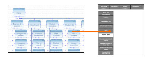
Figure 1 - Intuitect is a web prototyping plug in for Visio that builds interactive menus from a drag and drop interface. Sadly no longer appears to be available or supported.
Unfortunately, Intuitect no longer appears to be available or supported, but there are other tools that can also do the same thing. That brings us to our new favourite prototype testing tool, Naview designed and developed by Volkside.
Naview is an excellent little tool that takes most of the pain out of developing a prototype IA for testing and review. What used to take a laborious 2-3 hours tweaking in Intuitect and Visio now takes us literally minutes with a cut and paste from Excel or Word. Naview is still in beta phase and will evolve further in the near future. Volkside is working to make Naview more flexible with features like allowing choice between hover or click selection, sharing of the white site online, and the ability to add more than 10 sibling menu items.
When we start building the white site in Naview it looks like this.
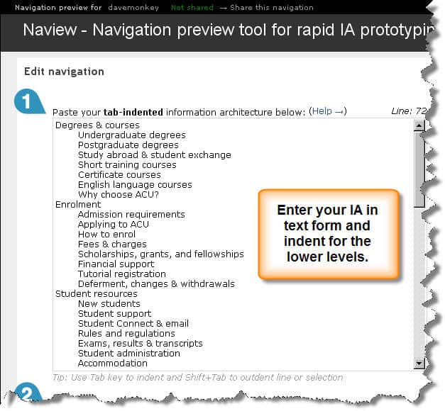
Figure 2 - Naview uses a simple text entry method to build the IA.
Once you click on the button to generate the prototype, participants see the white site as per the picture below.
The white site presents users with a clean menu structure with no distracting visual elements or page content. As they either click or hover over the main menu, a second level navigation drops down. The user can then select a 2nd level menu item and be presented with a third level menu if you have included 3 levels of menu.
You can view your IA in either a horizontal or vertical menu orientation.
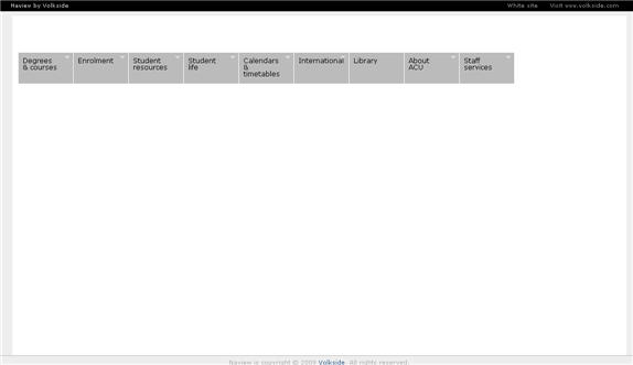
Figure 3 - The Naview interface in initial closed state - horizontal menu orientation
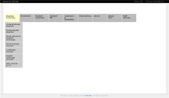
Figure 4 - The Naview interface in expanded state
Other tools to build your white sites with
The site can be built in HTML and CSS, Flash or any other web development and presentation tool by someone sufficiently skilled with the knowledge. But to be honest why would you? The effort in developing an interactive prototype is significant compared to spending a few minutes with Naview or a little longer with other web prototyping tools.
We recommend Naview for its simplicity and because it's fit-for-purpose to build a white site.22/10/2009
White site usability testing tips and tricks
We've used white sites for many projects now and we've learned a few things on the way that can make your life easier when using them.
- With your IA test tasks try to include a task for every item on the menu but ... if the item is painfully obvious or is of low importance or relevance to the user group you are testing with, don't include tasks for those items at the expense of exploring other navigation labels.
- Make sure when writing task scenarios for testing that you don't include words in your scenarios that align with the words in your menu structure. Otherwise test participants will just match words and labels and not really think about the task (see also Jakob Nielsen's August 2009 Alertbox on this issue.
- If a label isn't working change it! We'll often get into the second or third participant during IA testing and realise that a menu item just isn't working. We usually ask users for different suggestions on difficult labels or ask them during testing "what sort of words are you looking for?" Using the Naview tool, you can change your IA and re-generate your white site in a couple of clicks and in a matter of seconds.
- If you've developed home page wireframes or other prototypes you can test these at the end of the session to save on recruitment time and costs. We usually develop a set of wireframe specific scenarios to test parts of the homepage directly after testing the IA.
- Reduce the usability problems on your white site by making sure that menu items are large and can be easily clicked.
What are the benefits of testing with a white site?
- Decrease your development time and costs by identifying usability problems with your IA early.
- The navigation is presented in a format that looks more like a website rather than a survey style or index card format. As such, we believe that user behaviour and decision making regarding menu choices are more likely to reflect real online navigation behaviour.
- There are no other variables to confuse users or prop up a potentially bad IA such as good content, cross-linkages or in–page content links. You're just testing the information structure in isolation of any other variables. If it tests well, you know that it is a good IA.
- It's easy for anyone to build with the right tools. You don't need to be a developer to whip up a quick interactive electronic prototype. It allows for quick and dirty testing that can sit with more agile approaches to project management and web development.
- No fiddly index cards. Saves on trees as well!
After the white site
Once you have done white site testing and/or you want to test a more detailed high fidelity prototype, we recommend having a look at some of the other web prototyping tools that are available. Suze Ingram's presentation at this year's Oz-IA conference gives an excellent overview of some of the web prototyping tools available. Here are just some of the available tools that Suze and our team have come across that are worthy of further investigation:
These tools are all of different levels of functionality and cost but are worth checking out if you want to be able to do more with than just white sites with your prototyping tools.
Usability tip
Visual design, imagery and content are critical for building trust and credibility
If any part of your site's content is out-of-date or has typographical errors, users can quickly decide that they can't rely on any information on your site. If this is the case, your call centre or internal service area might be fielding a number of unnecessary calls from users who should have been able to help themselves online. Page last updated or reviewed information on the page can be a useful way to communicate information is up-to-date.
When we do intranet projects we often find employees calling internal service areas like HR for confirmation that the online information they have found on the intranet is correct as they just don't trust the information. Building trust may help reduce the number of calls.
Additionally, if the visual design and images are felt to be out of date, unprofessional or inappropriate then users' perception and trust of the website may be eroded. The Stanford Persuasive Technology Lab has conducted many studies over the years and found that there is a clear link between solid design and site credibility. Users are more likely to believe sites that look professional and appear visually appropriate to the subject matter.
Recent research conducted by Phillips & Chaparro found that users base their first impressions of a site on the visual design. User perceptions of a low appeal website were not significantly influenced by the site's usability, even after a successful experience with the site. So even if your website is highly usable, if the website doesn't look appealing they may not trust the information and may have a lower overall perception of the website.