Do you think Frodo would have agreed to take the Ring to Mount Doom if he knew he'd get stung and almost eaten by Shelob, stabbed by the Witch-King of Angmar, captured by the Orcs of Cirith Ungol, and his finger bitten off by Gollum, not to mention a very long walk with no second breakfast? Hell no! Had he known all this, he probably would have turned right around and rushed back to the Shire to Bag End. And where would Middle-earth be? Thankfully, Frodo's quest didn't seem so hard when he started off and it was only as he progressed through his journey that each of these challenges took place.
So, what's this got to do with UX?
Like Frodo's journey through Middle-earth, when users come to a form or process of steps (e.g. an online checkout) on your website, it is better to ease them through the experience instead of overwhelming them with all the fields, inputs, and questions at the start. Responsive disclosure (also known as staged disclosure) can be a very effective design pattern to reduce the cognitive load on users, when used and implemented correctly. We have spoken about gradual engagement before, and this is a very useful specific refinement of this philosophy.
Responsive disclosure, a form of progressive disclosure, starts with a very simple UI, then gradually takes a user through a step-by-step process, disclosing further elements as the user progresses through the steps.
This pattern can be especially useful for long and complex forms. It can reduce the sense of dread the user may feel with too many questions or input fields at the beginning ("Look Frodo, you only need to get to Rivendell - that's it"). As a user works through a form, more fields dynamically build based upon the user's previous selections (see example below). Responsive disclosure allows users to complete tasks easily and quickly, since the user is not constantly switching contexts and workflows. Furthermore, the cognitive load on users is eased with this pattern, as users do not have to think too hard about what to do next. The UI presents the subsequent steps, questions or tasks automatically, ensuring only the relevant or necessary information is presented. This pattern helps to reduce user error, ease stress and confusion, and build trust all while retaining a minimal UI.

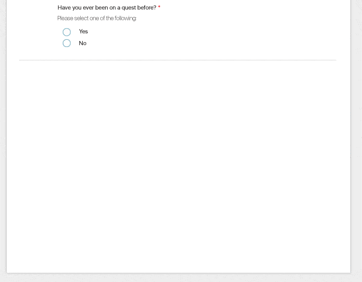
First question in a dynamic form using responsive disclosure before a selection has been made.

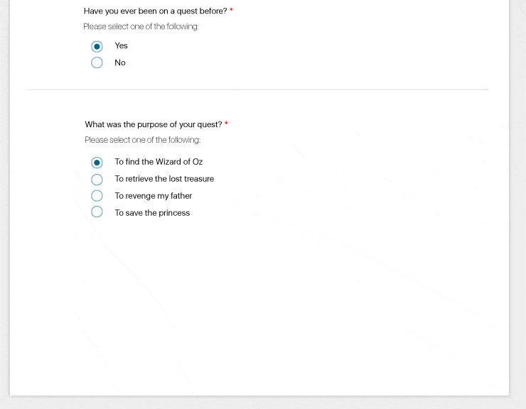
After an answer has been inputted, the form automatically shows the next question or task based on the previous answer.
Be careful, however, for dynamically displaying content can lead to confusion if the pattern is not implemented correctly in both front- and back-end development or content is not presented in a well-structured and logical manner.
None shall pass!!
via Indestructible
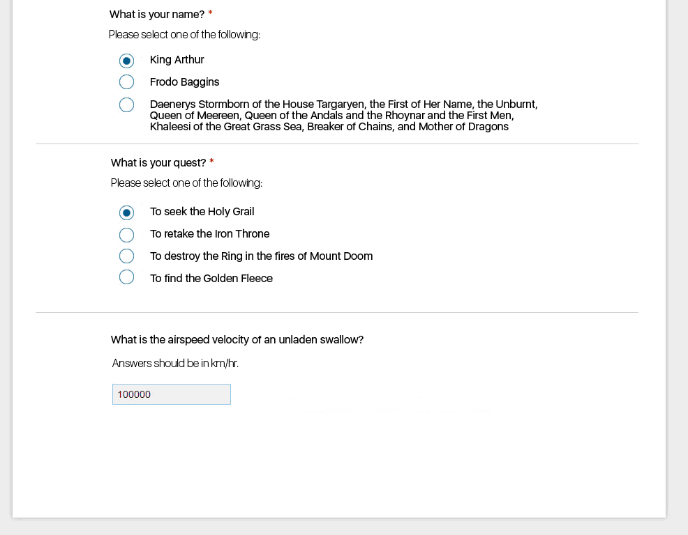
We recently tested a complex form for a client that used responsive disclosure by dynamically loading content as the user selected and inputted answers. At the beginning of the form (see example below), users were conditioned to select an answer from a radio button and then have the next question automatically load. After a couple of questions, users were presented with a new type of input field – a field based one. Once users entered in their information, they did not know how to continue onward with the form.
Was another question supposed to load?
Were they supposed to go to the next page - how?
Was this the end of the form, and if so, how could they submit?
Many users tried hitting 'Enter' to commit their answers but nothing happened. Users were actually required to click anywhere outside the input field to progress past that question and have the next one load. While many did eventually click accidentally, few understood the mechanism that allowed them to progress. Users became utterly lost, confused, and frustrated during this process.

Clicking outside the text field to proceed was not only an odd user interaction but also broke the conditioning established by the form.
Sudden changes in UI behaviour can confuse and disorient users, especially when content appears dynamically then stops appearing for no obvious reason to the user. To reduce this negative impact and prevent user's giving up, it is imperative to implement a consistent style of interaction, make it clear to users how to navigate through a form/process, and enable multiple navigation methods (mouse & keyboard).
Many users interact with a form by using their keyboard to navigate between fields, so it is important to have the proper back-end configurations to ensure this is enabled and works as expected. "Tabbing" should sequentially move a user from input to input regardless of input type, and pressing "Enter" should commit field based inputs and subsequently activate the next input. By supporting this interaction feature, you allow users to more easily and directly complete their task, which is one of the main reasons to use responsive disclosure to begin with.
...it is imperative to implement a consistent style of interaction, make it clear to users how to navigate through a form/process, and enable multiple navigation methods (mouse & keyboard).
Along with implementing keyboard navigation capabilities within your forms, it is important to include visual cues for users on how to progress through a form that dynamically builds; especially if you use text based input fields along with selection based inputs. To help guide your users through your form and solve the problem as per the example above, we suggest:
- Provide an 'APPLY' or 'NEXT' button to the right or below the text input field, which then loads the next input option.
- Have the next non-variable dependent part of the form preloaded, so users can see they still have questions to answer. Upon entering the variable data the form can then load the next part of the variable dependent. Using a visual cue to draw the user's eye to the newly added input option will assist in this approach.
- If a spotlight transition cannot be implemented, consider greying out the next non-variable dependent part of the form, which was preloaded so users know something was missed.
- If this input field issue occurs at the end of a section, have the "Continue" button visible but greyed out.
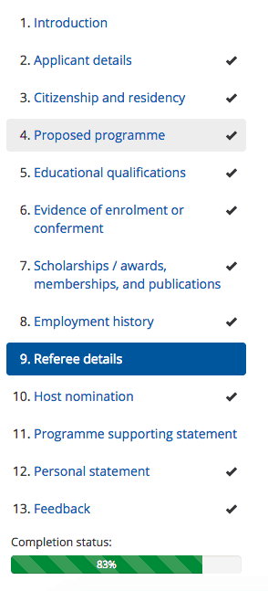
Finally, it is recommended to use responsive disclosure in conjunction with a progress meter, which lets users know how close they are to completing a task by presenting them with percentages or tick marks along the way (see example below). Think of it as Gollum telling Frodo and Sam how much further they had until reaching Mount Doom – it was "comforting" to know they were getting closer to their goal, because as humans (or hobbits) we are driven towards accomplishing our goals. See Kiss Metric's article for more information on progress bars and how they positively affect psychological behaviour.

(Source: Endeavour Scholarship)
Overall, when employing responsive disclosure, ensure:
- Keyboard interactions are enabled
- Content loads and is presented consistently
- Paths are clear
- A progress meter is used to communicate to users point in the process
- Content is made available to users at appropriate and meaningful times
By doing this, when you employ responsive disclosure in forms or processes you will be giving your users a rich user experience that ends with second breakfasts for all.

via MTV Images
Sources
Jenifer Tidwell Designing Interfaces
For information on content strategy relating to progressive and responsive disclosure, see UX Booth's article.
Usability tip
Form labels
To make your forms user friendly, make sure you are implementing the right style of labels. Top aligned labels enable users to scan quicker than left- or right-aligned labels but require more whitespace between fields as to not overwhelm users with too many elements. Top aligned labels allow users to work through a form without constantly changing their visual focus and direction. This style of label will make forms longer but will be simpler and easier for your users to fill out, saving them time and effort overall.
