
In terms of high stakes for getting a form’s design right, it doesn’t get much bigger than a Census. It collects data that will inform government decisions for years to come. It’s essential that a Census form is highly usable by every demographic across the Australian population. In 2016 we evaluated the user experience for the 2016 Australia Census which didn't do so well. So how did the online Census perform this year? The PeakXD team reviewed the user experience of this year's Census and there are some interesting lessons all UX designers can all take away.
The Australian Census back in 2016 was... let’s diplomatically call it contentious.
It was the country’s first full-scale attempt to conduct the Census via the internet. Some politicians threatened to stage a boycott. Network infrastructure failures spooked the Australian Bureau of Statistics (ABS) into taking the Census website offline for about an hour – right at the time most Australians had been primed to sit down to complete the survey. There was even a Twitter hashtag - #Censusfail. The only thing missing was its own version of Twitter’s Fail Whale.
What were the UX issues in 2016?
In 2016 we highlighted a variety of user experience issues with the 2016 census user experience, such as:
- People discarded their Census letter from the ABS, thinking it was junk mail.
- Data security and privacy fears affected people’s willingness to answer truthfully.
- Reasons and value propositions for people to supply their information wasn’t clear.
- Poor use of progressive disclosure. Tania mentioned she was surprised that the site asked about the marital status of her 5-year-old child.
- The Census site wasn’t designed to handle iPads - some fields wrapped awkwardly in places.
- If somebody needed to step away from completing the Census, for instance - to care for a child, the site wouldn’t protect their data unless the person actively clicked on ‘Save and exit’.
These are only a few of the points from Tania’s expert review of the 2016 Australian Census. Broadly speaking, they demonstrate shortcomings of a few user experience design principles:
- Understand your users
- User confidence and trust
- Flexibility and efficiency of use
- Protecting users’ work
It’s been five years since the 2016 Australian Census – what has improved since then?
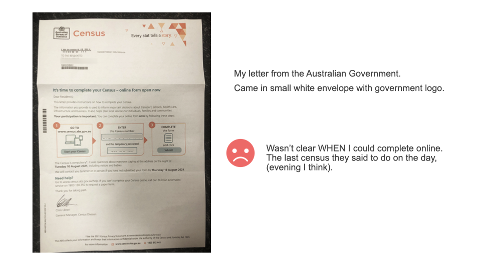
The Census letter
The 2021 version of the Census letter arrived in a small ABS branded envelope clearly marked with orange and teal text "IMPORTANT: Your Census instructions are inside. OPEN NOW. The Census is compulsory." This is arguably a lot clearer and a significant improvement on the 2016 Census envelope which just had "Your Census Login inside. Keep it safe".
However, what wasn't clear in the letter was when you could undertake your Census. Perhaps the ABS had learned from 2016, and made the online form available for the entire day?
The infographic containing the unique “Census number” and temporary password worked well. Building the real information into the instructions helps users contextualise how and when to use it.
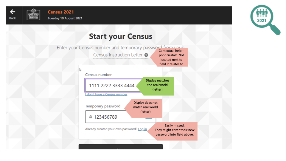
Start your Census
The Census survey opens with a login form, using information from the Census letter.
We should give credit where credit is due – this kind of offline-to-online handover is difficult to get right.
There were some points on this form which PeakXD thought could be improved:
- A misalignment of contextual help messages, which were often separated from the input fields to which they relate.
- The 'Census number' input field automatically inserts spaces as a user types – lovely. Aligns with how the number is presented on the letter.
- Curiously, the 'Temporary password' field does not automatically insert the same spaces as a user types.
- For a user who has already created a password (which is part of the next step), the option to enter their own password is very small and would be easy to miss.
Set a new password
We noted the Census site did a great job with its password complexity indicators and its tailored error messages. Allowing users to select their preferred password recovery option is an excellent demonstration of usability heuristics of “Flexibility and efficiency of use” and “User control and freedom”. Also "Visibility of system status" and "Error prevention" by dynamically updating password rules as they type.
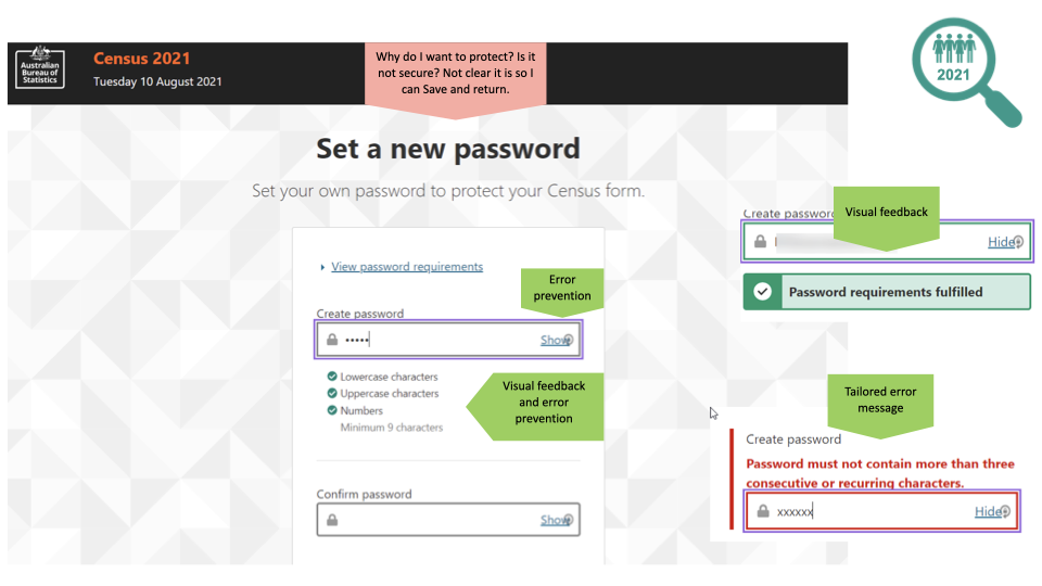
Protection or value proposition?
The Australian Government asks that every person in a house complete the Census. For a house with lots of family members, or a house with people working late shifts, maybe it wouldn’t be possible to complete the survey in one sitting. Being able to save a user’s input is important; it aligns with the user experience design principle of ‘protecting user’s work’.
So when the Census site asks users to set a new password, it’s curious that the terminology refers to “protect your Census form” (emphasis added). All of a sudden, an idea that my data might not be safe has appeared. A users’ confidence and trust might be shaken by the word ‘protect’. This may add a little tension to users’ willingness to provide their personal information.
Instead, this simple line of text could be an opportunity to demonstrate a reason and a value proposition: Set your own password so you can pause and resume your Census.
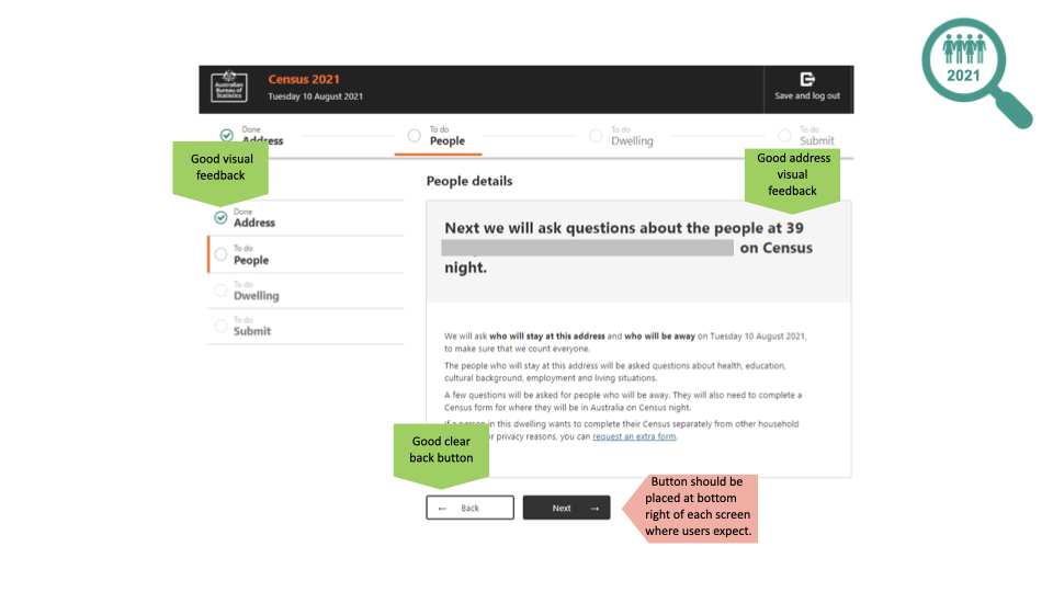
The Census form
Throughout the Census, the questions use the respondent’s name: “In which country was Dan born?”. This is excellent use of the user experience design principle of “Recognition rather than recall”. This means that I don’t have to work to remember whether I’m completing the Census for myself or for one of my four children.
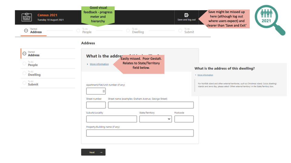
The progress indicators shown throughout the Census form received praise from the PeakXD team. The design allows users to understand how much of the Census they have completed at both a macro and micro level.
The team noted consistently lacklustre use of Gestalt theory, regarding the placement of contextual help. We found that many “More information” links appeared underneath a heading. It's better to place them alongside the relevant form field.
Asking relevant questions
Throughout the Census form, there was a consistently good use of progressive disclosure. This is a user experience design principle that hides questions that are not relevant to some users and streamlines the experience.
Compared to the 2016 Census, the question about marital status was not asked for a child (thankfully), and as a biological male I wasn’t asked about giving birth. Having said that, it is possible for a person to have given birth and also not identify as female. Questions that approach biology and gender require sensitivity and nuance – work with affected groups to understand their needs.
In one instance, “What is the address of this dwelling”, we found a “More information” link located immediately underneath a page heading. Inside the contextual help was information about which state or territory to choose, if you live on Norfolk Island or one of Australia’s other territories. Ideally, this contextual help should appear alongside the field marked “State/Territory”.
Also on the “What is the address of this dwelling” page – users had to enter their address. But the Australian Bureau of Statistics already knows the address associated with my Census number! This could have been an opportunity to pre-fill the address information into the form because there would be a reasonably high level of confidence regarding the information. This would align with another user experience design principle, “Recognition rather than recall”, in which we design systems so users don’t need to re-enter information a system should already know. Of course, there may be good business reasons why this was not done which we appreciate.
Personal details
Two of the survey’s questions received considerable commentary within the PeakXD team, and on Twitter throughout the Census day: Gender and Religion.
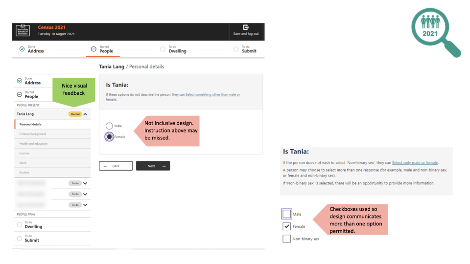
Gender
Two radio button options for gender appear on the form. This falls short of inclusive design, as there is widespread understanding in 2021 understanding that gender is a spectrum.
Non-binary options are available – however, the user needs to do a little more work. They can “select something other than male or female”, which opens up a third option.
How well does this align with inclusive design? On one hand, it forces non-binary folks to work a little harder for their recognition, which sucks from a moral perspective. On the other hand, it potentially obscures the matter from folks who might challenge its inclusion in the Census.
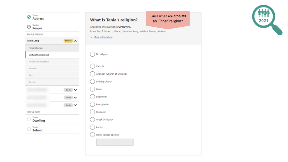
Religion
No, “Jedi” still isn’t an option. Sad face.
The contextual help suggests examples of other religions – “Lutheran, Salvation Army, Judaism, Taoism, Atheism”. Wait a minute… Atheism specifically rejects religion. This is an example of needing to understand your users, which is one of the user experience design principles.
The list of religions skews toward Christianity, specifically the Protestant denominations. Interestingly, there is no representation yet of the Pentecostal churches, such as Hillsong. The Census lists six flavours of Christianity, while Islam is simply “Islam”. The same goes for “Hinduism” and “Buddhism”.
Support users’ emotive needs and design for inclusion. Don’t break their trust by alienating them if you want them to answer questions honestly.
Mobile devices
Mobile and tablet devices are as common as desktop devices in 2021 with nearly half of all users in Australia accessing the internet from these devices. It’s easy to imagine a parent sitting on a couch with an iPad, completing the Census while kids watch TV.
The PeakXD team noted the Census form worked significantly better on mobile devices this year.
Save and log out
Our lives are busy and prone to unexpected interruptions from social media, children, dinner starting to boil over, or whatever the cat is eating. The ability to pause and resume an effort-intensive task such as the Census is essential.
The position and label of “Save and log out” seem very intentional, on the part of the designers. A “Save” function would often appear in the body of a page, perhaps immediately after a set of questions. But a “Log out” function universally appears in the top-right corner of a website’s header. And this is indeed where the button is placed. The label reassures users that the button’s role is “Log out (and your work will be saved)”.
The placement of this button, in conjunction with its purpose, aligns with the user experience design principle of using “Consistency and standards”. Place buttons where your users expect to find them.
What changed between 2016 and 2021?
| 2016 | 2021 | Outcome |
|---|---|---|
| Many people discarded their Census letter from the ABS, thinking it was junk mail. | Risk of people mistaking the Census letter for junk mail but the design of the letter and envelope improved so risk was likely reduced. It was also much easier to recover from this user error by requesting a pin online. | Big improvement. |
| Census site went offline. | No reports of outages. | Big improvement. |
| Data security and privacy fears had likely affected people’s willingness to answer the survey truthfully. | Some points where trust could have been eroded. More susceptible to backlash regarding poorly-handled questions regarding personal details. | Improvement, with room to grow. |
| Reasons and value propositions for people to supply their information weren’t always clear. e.g. opening up records in 99 years for your descendants researching family history. | Reasons and value propositions for people to supply their information weren’t always clear. | Improvement, with room to grow. |
| Poor use of progressive disclosure. | Great use of progressive disclosure. Showing all questions, and then invalidating the irrelevant ones worked well. It felt as though the amount of work required was being reduced. | Big improvement. |
| The Census site wasn’t designed to handle iPads especially well - some fields wrapped awkwardly in places. | No issues detected by our team. | Big improvement. |
| If somebody needed to step away from completing the Census, for instance - to care for a child, the site wouldn’t protect their data unless the person actively clicked on ‘Save and exit’. We know some people who lost data that took 30minutes to enter when the site crashed. | “Save and log out” offers a thoughtful option for users who need to pause their completion of the Census. Users’ answers appear to be cached within the browser during the session. The ability to Edit the responses of a person is an excellent inclusion (at least, before the final submission of the Census form). | Big improvement. |
Overall, the team at PeakXD highly commend the UX designers working with the Australian Bureau of Statistics. Designing a form for a whole nation is a colossal responsibility. Their work includes lots of great examples of good user experience design, and a few places to think about the implications of those principles.
Think about the online forms you work with, or the forms which you design – how well do you support all of your users’ needs?