
In 2011, we wrote a white paper on Designing Usable Mobile Websites which included general usability guidelines for mobile websites. In this edition, we thought we would delve into content writing for mobile web.
Writing for the web takes practice, research and detachment. Effectively writing for the mobile web takes all this and more. Until recently, websites were typically accessed by users sitting in the comfort of their home or office behind a nice big computer screen with time to focus on the task at hand. Mobile now accounts for over 8% of all web traffic both in Australia and globally and the mobile web experience is a completely different ball game. Your users may be accessing your site on the bus, in a retail store, during the TV ads or even at a ball game. All of this has an impact on how you present your mobile content and how your users interact with your website. The good news is, to create a highly usable and engaging mobile web experience is not as hard as you think. You just need to go back to the basics:
- Understand your mobile users
- Understand and prioritise key user goals
- Design content to meet user goals and context
Read on for details on how to do this for your mobile website.
Understand your mobile users
Who are your mobile users? Are they different to your general website users? Consider conducting at least some basic research to understand your users. Try filtering your web statistics to isolate your mobile users, their characteristics and what they are looking for on your current site. e.g. if you sell car insurance, you might find your mobile users are younger more tech savvy than your regular website users.
Understand and prioritise key user goals
What do they want to do on your mobile site? What are they looking for? An analysis of one of our recent client's mobile web analytics showed that more than 50% of their mobile users were looking for store locations (no brainer) but there was also a particular focus on brands and suburbs. For instance, earlier this week Tania was in Sydney conducting training and searched for "Nespresso Sydney" using the brand and the location to find a stockist. Bottom line - make sure your mobile web content addresses key user goals and uses keywords and brand names they are likely to be searching for.
Once you understand the key user goals you are in a better position to prioritise them based on alignment with your business objectives and proportion of users who have that goal.
Design content to meet user goals and context
We have outlined some guidelines to create usable mobile websites in our earlier article on Designing Usable Mobile Websites. For mobile web content design, there are a few specific things you can to do.
Remove unnecessary content
At the UX Australia 2011 conference, I heard that Facebook apparently are more focussed on their mobile interface now than their website. This is obviously paying off for them. I have lost count of the number of people who have told me they prefer the mobile Facebook interface to the regular Facebook webpage as it is much more focussed on what they want to do and doesn't have all the 'fluff' that they don't want.
So for your mobile website, try to increase the signal to noise ratio as much as you can so key messages are not lost in the noise. Take out all that superfluous fluff that most users aren't interested in.
Halve the word count and cut to the chase
In an article Mobile Content Is Twice as Difficult, research conducted by R.I. Singh and colleagues from the University of Alberta showed that comprehension scores when reading complex web content from a mobile screen were almost half that of desktop monitor scores. For general websites we recommend web content should be 75% of the print equivalent as users read slower on a computer screen. For mobile web we recommend that you aim to half this again. In short, don't ramble on. Mobile web users are generally in a hurry and you have very limited screen real estate to get your message across quickly.
Hide secondary content
Okay so don't stress if you can't halve the content. It takes skill, practice and detachment. Another strategy you can use is to hide some of it. Use layering - such as accordion collapsible panels that users can expand and collapse to view the content they are interested in. Wikipedia have done this well. You can also just link to a new page or provide deep links to your full website as GIO do.
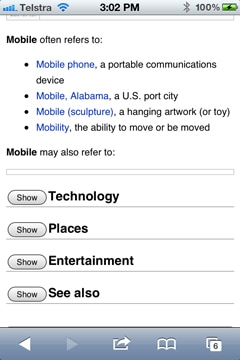

Figure 1: Wikipedia with collapsible accordion panels and GIO with deep links to the full site
Use basic or small images ...or none at all
Don't include large images but do allow users to click on thumbnails or easily zoom images if they are interested.
Hone your web content writing skills even more
When people use the internet they're generally trying to find information this means they don't read everything - in fact they skim read - searching for any keywords that match their task. They skim over a few words then move on. If they are walking down the street or sitting on a bus, they only have a few seconds and are very task focussed and just want to find the information they are looking for very quickly e.g. where to catch a bus, movie session times or their closest bank.
Consider other external factors such as:
- slow and sometimes flaky bandwidth
- bright outside lighting or noise
- external distractions e.g. kids screaming in the car
With these factors you can understand the need to effectively get your message across - quickly!
Provide a synopsis or summary of content
This synopsis or summary could either be at the top of the page or a whole screen with prominent links to more detailed content below. This communicates the key message and helps users decide whether or not to commit to reading it.