
A Merry Everything for December! We have some presents for the stocking (or, in my youth, the pillowcase) for all of our faithful readers. We showcase some of the tools we've successfully used to help our work and we'd like to share them with you. Some are free, some are low cost and all are extremely useful. We also highlight coming usability events in December and January and give our usual usability tip.
Usability and UX stocking stuffers for you
. . . better than the Crazy Clarks presents from Grandma and with just as much love.
Well it's Christmas time and we at Peak Newsability wanted to leave a little present under the tree for all of our loyal readers. We got together and compiled a list of some of the free and low cost tools that we've discovered over the last year; tools that have made life easier for us in our daily work as usability and UX people. We'd like to share these with you so that you might discover them too and perhaps use them to help you in your work.
WordArt
WordArt is a neat online tool that creates word clouds. Cut and paste a whole bunch of text into the tool, click the magic button and voila! - a word cloud is created. The more instances of a word, the larger it appears. WordArt can also remove all of those tedious prepositions, conjunctions and other common words, so your word cloud is not overwhelmed with 'and', 'but', 'the' and all those other little three letter words (there is an option to return them.)
The example below is from our last newsletter about IA testing and you can see some common themes emerging.
What's it good for? We find it useful for three things.
- It can help with analysis if you just want to get a quick overview of your user or business research. Copy and paste all of your transcribed notes into the tool and the resulting word cloud can help you quickly identify some high level themes running through the research.
- It can help you with making sure you haven't overused any words when writing cards for Card sorting
- As a presentation tool for key findings from user research. Tables of text data make poor presentation material but a WordArt diagram can prove to be a compelling talking point for your research findings. You can configure the cloud to display in a number of different styles and colours to suit your aesthetic needs. (see below)
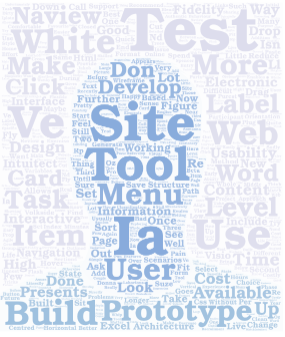
Figure 1 – Examples of a word cloud from WordArt using text from our article on IA testing
fivesecondtest
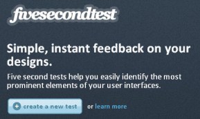
Figure 2 - fivesecondtest.com screenshot
Do you have a design you have created and you want some instant feedback on whether the important elements are standing out? Are you having an internal team discussion on what is the most prominent or distracting feature on the page but can't reach consensus? Are you trying to convince someone that nobody is going to see that critical link lost deep down at the bottom of the page? Then thefivesecondtest website is what you need.
We had a situation like this where we couldn't agree about the visual hierarchy of a site we were evaluating and realised we were each approaching the issue from our own frame of reference. So we called in the experts, random interweb users. We uploaded the homepage to fivesecondtest, asked users to look at the page for 5 seconds and then tell us what they noticed. What people really noticed surprised us both. What they noticed was the branding and people's faces and we realised that this prominent branding was breaking the visual relationships between functionally related elements on the page. This made it much less likely for users to notice the changes that had taken place to the pricing element on the page. It was a watershed moment for the review.
How does it work? You upload an image to fivesecondtest.com, define whether you want a memory test (testers write down the five things they remember seeing on the page) or a click test (users click on the most prominent things on the page and describe them). It's quick, it's dirty, but it can give you some instant feedback about which elements are visually prominent in your design.
It spits out some pretty easy to use results that make it simple to drag like terms together and supports export to Excel.
Naview
We mentioned Naview by Volkside in our last article so we won't dwell on it too long here, but we do want to remind you what a wonderful tool it is for previewing an information architecture (IA). You can save and share your navigation model for up to 7 days, making this feature a great way to collaborate on an IA design. But, you saved your IA it as a text file didn't you? Didn't you? No problem. It takes such a short time to build the IA (from that text file you saved) that the sharing feature is a great way to visually communicate and gather feedback on your IA . Jussi has put a lot of work into making Naview a useful tool for IA usability testing so why don't you try it out now! A couple of people have commented that Naview has some menu limitations but without giving too much away, keep an eye on this tool as Jussi is working hard to improve its functionality.
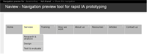
Figure 3 - A Naview navigation preview in action
Twtpoll
While we're talking IAs it's not uncommon to have those moments where you are struggling with a number of different menu labels or you're just not sure where to put a piece of content. You need some feedback from users and you need it soon. For just this sort of instance Twtpoll has come to my rescue a few times and I've seen other IAs use it successfully in the same way (tip of the hat to @mirandaforwood).
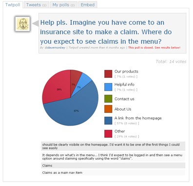
Figure 4 - A Twtpoll run recently when assessing an insurance site.
Originally a Twitter only tool, Twtpoll has now expanded its notification service to Facebook and email and gives you a myriad of question type options. Just create a poll question, enter your options and post it. It will send a message on your nominated Twitter account and hopefully your followers will respond. It's a nice way to get some instant insights into a label choice or just an answer to a question that you need an outside perspective on. You can brand polls on the paid service but I think the free service is a nice informal way of gathering a bit of instant user feedback. Just be careful though when testing labels in isolation of the rest of the IA as changing one label can affect users' ability to complete other tasks.
Chalkmark
New Zealand's Optimal Workshop have produced a number of great products such as Treejack for evaluating IAs but we recently had the opportunity to observe Chalkmark in action. Like the fivesecondtest.com it is a tool for quickly evaluating website designs but Chalkmark offers the opportunity to give users specific tasks to evaluate where they would click on a particular design. The results it provides are presented as a heat map which can show you where each person clicked for each task. This is a great tool for evaluating prototypes and A/B testing and we recently used it in a large project.
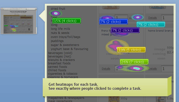
Figure 5 - Chalkmark results in heat map form.
Clicktale
Many people will tell you that you can't go past Google Analytics when it comes to free or low cost analytics tools and it is pretty neat. However we've partnered with ClickTale, which is an exciting analytics tool that offers a little more in terms of how it records and displays your analytics data. ClickTale is unique in that it records real time screen capture of your visitor's browsing sessions which you can play back at your leisure. It also provides informative heat maps that can tell you where users are clicking on your page or what parts of the page are most often in the user's field of view (see image below). Additionally, ClickTale provides some excellent forms analytics that can tell you which fields users are failing and where they are bombing out of your form.
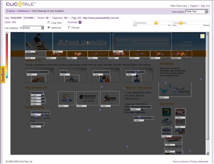
Figure 6 - A Clicktale heatmap of our site. The more traffic and the longer you keep it running the more results.
ClickTale is available on a number of different pricing plans that won't blow the budget and allows you to choose a level of tracking to best suit your needs. If you are interested in their enterprise version for large organisations, please contact us.
Balsamiq Mockups
Balsamiq is a wireframing tool and there are a lot of wireframing tools out there. The thing I like about Balsamiq and a lot of the other cheaper wireframing options is they are great tools for sharing ideas and iterating a design. We mentioned a number of tools in our last newsletter but wanted to mention Balsamiq because a client recently used it to successfully communicate design ideas to us when we were trying to rapidly turn around a wireframe we were working on. It favours quick low fidelity prototypes that are great for idea generation and prototype iteration. We wouldn't use it for deliverables and are unlikely to use it for testing, but the mock-ups serve their purpose as communication tools and a basis for agreement between stakeholders. Balsamiq isn't free but is available for under $100 US and is a great addition to any IA's or UX worker's toolkit.
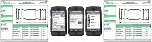
Figure 7 - Balsamiq has a range of wireframing shapes and templates and a growing user community.
Visio & Omnigraffle stencils
While we are on the subject of prototyping we still mostly use Microsoft Visio and know that many of our clients who work in Microsoft focused IT environments find it easier to buy Microsoft products. Visio is still a creditable prototyping and wireframing tool (it does other stuff too I hear) and it has a few shapes that can be used out of the box for wireframing. But there are a number of stencils freely available on the web that can provide you with some shapes that are useful for a variety of UX activities:
- Nick Finck's Visio stencils for Information Architects
- The GUUUI Web Prototyping Tool which allows you to create interactive prototypes
- Graffletopia – the best place on the web for OmniGraffle stencils
Usability tip
Presenting large documents for ease of use
While it may be tempting to simply make a PDF available online, it can be very frustrating for users to have to go through a long document to find what they need.
Important content should be available on HTML pages on the website – without having to look at the PDF document. You could also consider pulling the salient points from a document together into a quick reference guide for users.
If the full document is required in PDF, ensure that it's in an easy-to-read format, includes a table of contents with page numbering and links, and allows people to easily navigate and find information within the PDF. Ensure your page numbers align with the page counter in the PDF reader as we find this often causes major confusion for users (when the page numbering doesn't start on the cover page). Also ensure that PDFs open in a new window. We find that users seem to expect this and get quite frustrated when they close a window and lose their whole browser session because they incorrectly assumed the PDF would open in a new window.
Links to consider
- Inside User Research at YouTube by Sasha Lubomirsky, User Experience Researcher at YouTube
- Recommended books for your User Experience and Usability library- Redd Horrocks at UX Booth
- iPhone copycats are a modern day cargo cult – A talk by Jeff Veen "Great Designers Steal"