
How many of you out there have heard the term "usability heuristics" and still don't really understand what it means? Come on. Let's be honest. It is one of those terms that is widely used in this industry but we often find people working in our field who are a little embarrassed that they don't really know what it means.
Usability heuristics, rules, laws and things to remember - Part 1
A collection of things to remember to help you design more usable sites and systems
We cover heuristics in depth in many of our training courses including how to apply them to the design and evaluation of usable sites and systems. Our definition of usability heuristics describes them as "design rules of thumb" or "design principles" but we don't even like to include the word "rules" as this suggests that they can't be broken, which is often not the case. Our definition of usability heuristics is fairly consistent (albeit greatly simplified) with that from Interaction-Design.org who define heuristics as "rules of thumb for reasoning, a simplification, or educated guess that reduces or limits the search for solutions in domains that are difficult and poorly understood" .
So if you just apply a set of heuristics, such as those defined by Jakob Nielsen, does this mean you don't need to talk to a single user to develop a usable interface? The short answer is no. As anyone who has done extensive usability testing will attest, we can never just apply a set of design rules or laws and expect that our website or system will be highly usable. We believe that if you apply every heuristic, design rule or law to the design of an interface you will still only get half way to designing a usable interface. At the end of the day every site and system is different and you still need to apply user centred design methods to understand your users, their goals and the context or environment in which they are using your site or system.
So now we have that huge caveat in place, let's get on with our series of articles about usability heuristics and interaction design rules and principles. Rather than focussing on many of the widely documented and accepted heuristics, such as those defined by Jakob Nielsen, we thought we could discuss some of the often forgotten or little known rules of human computer interaction that should influence how you design your sites. This month we look at two of those heuristics: Fitts' Law and the Peak-End Rule.
Fitts' Law
Once of the many laws we cover in our 3 day UX design course is Fitts' Law. According to Wikipedia, Fitts' Law states that the time required to move to a target is a function of the target size and distance to the target and therefore the small and more distant a target, the longer it will take to move to a resting position over the target and the higher the error rate. The four corners of a screen are the most quickly accessed because the edges of the screen create 'infinite' space in certain directions where the user is not penalised for continuing to push the mouse cursor against the edges of the screen such as in Windows 7's start icon (below) or in the Mac OS X dock.
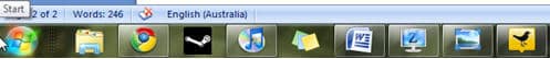
Figure 1 - Screenshot of Microsoft Windows start icon
So how does this work in action? Take an example from a highly regarded market research company's website (that shall remain nameless) where you get rewarded for performing surveys. The login box on the homepage is in the far right top corner of the page and the button is tiny (16X15 pixels or 240 square pixels). Users have to be precise when clicking the button and those with less developed or impaired fine motor skills (such as those with arthritis) are going to have varying degrees of difficulty clicking on that button.
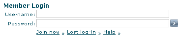
Figure 2 - Screenshot of login for yourvoice.com.au
Contrast this with the login button for Highrise, our CRM system that tracks leads, customers and contacts by 37 Signals. It is 10 times larger than the previous example (74X33 pixels or 2442 square pixels) and centrally located in the page. This means users don't have to 'travel' as far to reach the button and the larger area means they don't have to be as precise. This should translate into a faster and less frustrating experience for many users.
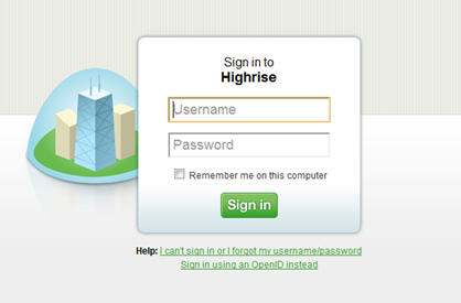
Figure 3: Screenshot of Login window for Highrise
The lesson here is use large objects (such as big buttons) for important functions and place them in the centre of the page or close to the last action so the user can quickly click on the button.
Peak-End Rule
The Peak-End Rule states that humans judge their past experiences on the peak of that experience (whether pleasant or unpleasant) and how it ended. The net pleasantness or unpleasantness or the length of experience is disregarded as is the length.
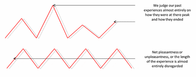
Figure 4: Diagram of Peak-End Rule
Source Mick Strevellin from 'Peak-End Rule' Danny Kahneman
What does this mean for your website? Users are going to remember two things about your site:
- The best or worst moment in their interaction, whether that's a moment of delight created by skilful design or the moment of frustration when they have just spent 5 minutes looking for a form and now can't find a phone number to get it mailed to them.
- How it ended – was it a success? Did they find what they needed? Complete that form? Watch the video they intended to? Or did it end in miserable failure. What taste does that leave in the user's mouth?
I'll illustrate this with a positive story (because there are so many negative ones and they're too easy). I am a big gamer and one of the conveniences of being an Xbox 360 gamer is that with an Xbox Live Gold account is that I can hear about a new piece of downloadable content and I can go to the Xbox Live site, login to the marketplace, find the piece of content I want and download it to my Xbox from the site. I could do this from any computer at any time and it is convenient (because I am frightfully absentminded). What I remember about the service is the pleasure of just nipping onto Xbox.com to do it and the happiness I feel when I hop onto my 360 and the piece of content is just waiting for me. This is despite a terrible IA on the site and a clunky UI. I do not have to actively go to my Xbox to download the content I am after.
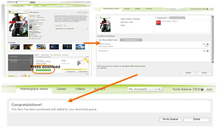
Figure 5: Diagram of process for downloading games from Xbox live site to xbox
So what does this mean for your site? Basically you have to be aware of all the links in the chain of the user experience. If your site has a nice front end but the payment system is hard to use and prone to failure that is what the user will remember. That your lovingly designed and highly usable templates will be meaningless if your application process forces a 10 second wait every time a user completes a form field while the data is validated. That your online store might look great but if it doesn't talk to your inventory and distribution systems then retail failures after the user has finished with your site are highly likely to be what they remember, not your brilliantly researched and designed electronic store.
Pay attention to the entire process. Try to maximise the peaks and minimise the troughs of the user experience and make sure the finish is consistent and what the user expects.
Usability tip
Reduce visual cues that may cause users to ignore content beneath the fold on long pages
The old rule that users don't scroll is giving away to mounting evidence from usability testing and analytics that just isn't true. But what testing has shown us is that creating a visual break in the page such as a horizontal rule, a large white space, a line of images or other rich media can cause the user to think there is no further content underneath the visual break.
Look at your designs in multiple common screen resolutions (1024x768, 1280x1024, 1680x1050) and try to establish if elements on the page make it look like it ends. Users will scroll but only if it is obvious to them that there is more content of value below the fold.
Also ensure that when you take the user to a new page, that a significant portion of the content above the fold changes. We recently conducted testing for a client and their search results page looked almost identical above the fold as the results were actually displayed below the fold. This really confused many users as they assumed nothing had happened.
Links to consider
Links that challenged us to think differently about usability and design