
Mobile UX Part 2: Sticky headers and menus
Sticky headers are persistent headers or menus that do not move when the user scrolls. There is some research to suggest that sticky menus are quicker for users to navigate a site and that most users prefer this type of menu. As research into the effectiveness of sticky headers on mobile sites is limited, we felt this was worthy of further investigation.
Background
Denney (2012), makes the claim that sticky menus are 22% quicker to navigate and are preferred by 100% of participants tested using websites accessed via desktop machines. However, this previous research appears to focus more on websites accessed via desktop computers rather than via mobile devices. The issue with viewing websites on mobile devices is the very limited real estate, so we were interested to see how well sticky headers tested when using mobile devices.
What we did
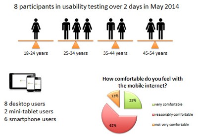
We decided to conduct our own little research study. We conducted mobile testing in our favourite cafe with 8 participants for 10-15 minutes each. Testing involved an iPhone and qualitative exploration with 10 prescribed tasks on 10 different mobile websites to explore a range of mobile UX issues.
We tested 2 different mobile websites:
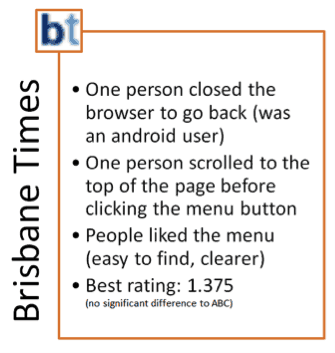
- Brisbane Times which has a sticky header and menu
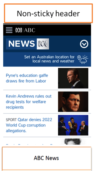
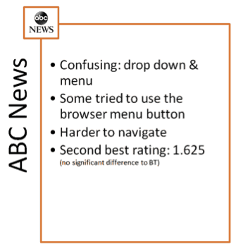
- ABC News which does not have a sticky header - the menu and logo disappear when the user scrolls.
For each site we asked users to view a story of interest. From that page, we then asked them to find the business section of the news website without tapping the 'back' icon.

What we found
Observations:
- People had no problem in finding the menu on the Brisbane Times website.
- Navigation at the ABC mobile website was tricky. There's a menu and a dropdown. Both included different headings and information. Participants were confused as to which button they should click.
User preferences
- The Brisbane Times site was rated slightly better by users than the ABC News site, although the difference was not significant.
Efficiency
- Based on our observations, users were generally more easily able to navigate to a different section of the site when there was a persistent sticky header with prominent menu button.
So what are we saying
Our research definitely fits in the category of guerrilla usability testing and is by no means conclusive. However, our results are fairly consistent with other usability test studies done using desktop computers.
Until more research is conducted in this area, we would make the following recommendations:
- Use only one menu button / drop down menu for mobile. Having multiple navigation options is confusing for mobile users.
- Sticky menus appear to be preferred by users and easier for navigation.
- Make sure, that the sticky menu is not too large as real estate is critical on mobile devices.
- Another option is to make the menu appear as soon as users start scrolling back upwards.
Learn more about mobile UX design in our 3 day UX Design training course.
Usability tip
Users coming to complete a task on your site are not interested in identifying as an audience type - they just want to complete their task.
When designing an experience that caters to multiple audience types you shouldn't try to funnel them through audience based navigation unless of course you need to direct them to unique content or functionality specific to their audience group e.g. a banking or telco site that has different products for business and personal customers.
No one comes to your site thinking of themselves as an audience type nor will they want to first identify as one when all they want to do is complete the task they came for. A strategic approach to writing your content can ensure it is generic enough to apply to all of your audience members and for the instances where a specific audience type needs special information include a strongly contrasting breakout box or alert feature with clear labelling to draw attention to unique audience-specific content.