
As outlined in Smashing Magazine, "The majority of responsive websites that use an icon to represent a hidden menu opt for the three horizontal stripes - these include some high-profile websites like Starbucks and also popular apps like Facebook".
This menu burger icon, or 3 horizontal lined 'navicon' as it is sometimes referred, has become a common convention for menu buttons on mobile interfaces. Users typically tap on the menu icon in order to expand the menu - which typically flies out to the side and disappears when they tap the menu icon again or make a menu selection.
You would think that given the number of high profile sites (such as PayPal) that have been using it for some time now, surely most users would understand what this icon means? A reasonable assumption, right? Well maybe not. Our recent research findings provide some interesting insights.
Background
When usability testing a number of our clients' mobile web sites over the last 12 months, we have often been surprised at how many users do not click on the menu burger icon when asked to undertake a task that requires navigating to an internal page.
For many testing tasks we have observed a general preference for users to scroll down and navigate using in-page links, instead of tapping the menu button. We also found the task completion rate was often quite low for tasks that required navigation via the menu navicon.
For mobile sites that included the word 'Menu' in the button below the burger icon, the task completion rate appeared to be higher. However, in these studies, our test objective was not to specifically test the usability and understanding of the menu burger icon, so the results are somewhat inconclusive and may be related to other design factors.
What we did
So we decided to conduct our own little research study. We conducted mobile testing in our favourite cafe with 8 participants for 10-15 minutes each. Testing involved an iPhone and qualitative exploration with 10 prescribed tasks on 10 different mobile websites to explore a range of mobile UX issues.
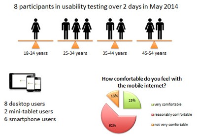
We tested 3 different mobile responsive websites with three different menu buttons:
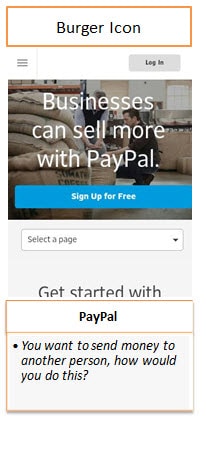
- PayPal with the three horizontal lines (burger icon)
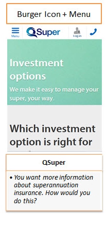
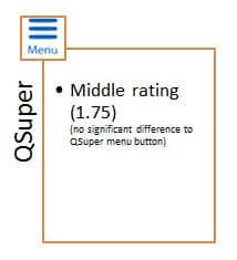
- QSuper with three horizontal lines PLUS the word 'Menu'
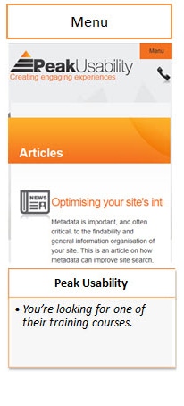
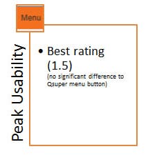
- Our own Peak Usability site with just the word 'Menu' on the button.
What we found
In our observations, users appeared to prefer to scroll and tap at links. Nearly all participants overlooked the menu button in all tasks.
There were no great differences between the different websites. Only the Peak Usability website with "MENU" as a button had a slightly better task completion rate.
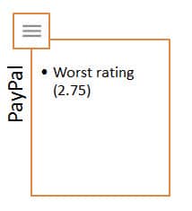
- The PayPal site (3 lines only) achieved the worst rating. Nobody used the menu and users appeared to have no mental model for that icon and did not understand its meaning.
- For the QSuper site (3 lines plus the word 'Menu') users partially used the menu icon, but not as their first action. Some users reported a higher recognition for icon + word.
- For our Peak Usability site ('Menu' button) users partially used the menu button, but not as their first action. The button was more obvious to users, although some didn't like the orange-black contrast.
So what are we saying
Our research definitely fits in the category of guerrilla usability testing and is by no means conclusive. However, our results are fairly consistent with other usability test studies we have completed this year.
Interesting, Facebook has recently moved away from the three line menu icon. They now use the three lines with the word 'More' underneath (on their mobile). Maybe their own research has led them to similar findings.
Until more research is conducted in this area, we would make the following recommendations.
- Menu buttons have to be more outstanding, eye catching, more prompting (but still small).
- Menu buttons should include the word "menu" within the button, or some other word e.g. 'More' if it follows on from other menu links.
- Provide in-page links for navigation that accommodate key common primary navigation paths (especially on the home page), as users tend to scroll down and use links instead of the menu button.
Learn more about mobile UX design in our 3 day UX Design training course.
Usability tip
Smaller touch targets are harder for users to tap than larger ones.
When designing mobile interfaces, make tap targets big with sufficient space around the tap area as well so that users can easily tap the correct target. This includes menu buttons and text links.
An MIT Touch Lab study of Human Fingertips to investigate the Mechanics of Tactile Sense (PDF) found that the average human finger pad is 10-14mm and the average fingertip is 8-10mm for most adults. Apple, Google, Nokia and Microsoft guidelines for minimum target sizes vary from 26px to 44px square but as a general guideline, we would recommend no less than around 28px or around 1cm square.